Designing a Mark for Systems: The Story Behind the ‘Design by Strategy’ Emblem
In enterprise consulting, design is rarely just about what sits on the screen. It is about understanding the broader system, including the underlying structures, competing business objectives, legacy technologies, and organizational realities that dictate how a product or service ultimately performs. When creating the identity for Design by Strategy, the goal was to craft an emblem that reflects this mindset: a mark grounded in precision, testing, orientation, and systemic balance.
Geometry & Symbolism: Rigour Meets Direction
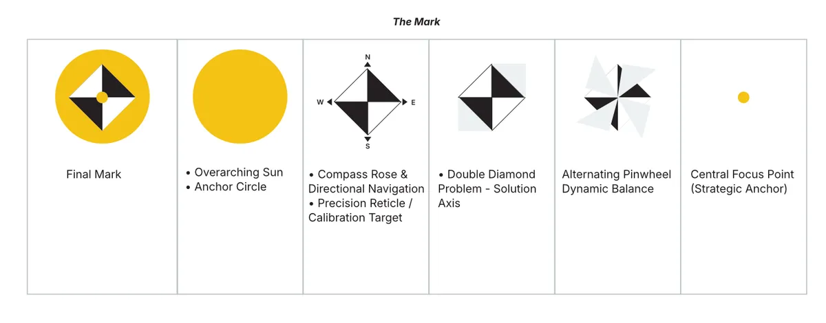
At first glance, the logo is a clean, high-contrast geometric symbol framed within a warm yellow circle. Beneath its minimalist aesthetic lies a layered metaphor for strategic design practice:
- The Overarching Yellow Circle (Illumination & Authority): The warm yellow circle provides the structural canvas for the entire mark. Evoking the expansive rays of the sun, the vibrant yellow makes an authoritative statement of clarity, energy, and optimism. It serves as an illuminating backdrop, symbolizing how strategic design brings warmth, light, and transparency to dark, ambiguous enterprise systems.
- Compass Rose & Directional Navigation: The four-quadrant diamond points strictly along the cardinal directions (North, South, East, West). Like a compass rose or navigation reticle, it signifies strategic orientation, navigation, and finding clarity amid complex systems, guiding organizations through uncharted organizational landscapes.
- The Calibration Reticle & Diagnostic Target: The alternating black and white quartered triangles resemble an optical target or diagnostic crosshair. In a consulting context, this conveys measurement, analytical rigour, diagnostic clarity, and precision, reflecting the practice of dissecting complex problems before prescribing solutions.
- The Double Diamond Axis: By rotating a square onto its cardinal axes, the mark forms two adjacent diamonds meeting at a central point. This is a direct visual reference to the universal design thinking framework, balancing divergent exploration with convergent decision-making.
- Dynamic Equilibrium (Yin–Yang Balance): The pinwheel pattern of alternating solid black and white fields creates a sense of rotation and balance. It reflects the daily balance required in enterprise design, such as marrying user needs with business goals, or harmonizing strategic vision with technical constraints.
- The Focal Point: At the absolute center sits a single dot matching the background circle. It represents the strategic anchor, bringing disparate inputs, cross-functional stakeholders, and systemic complexity together into a single, actionable focus point.
Typography & Color Architecture
A strong symbol requires typography and canvas choices that support, rather than compete with, its structural discipline.
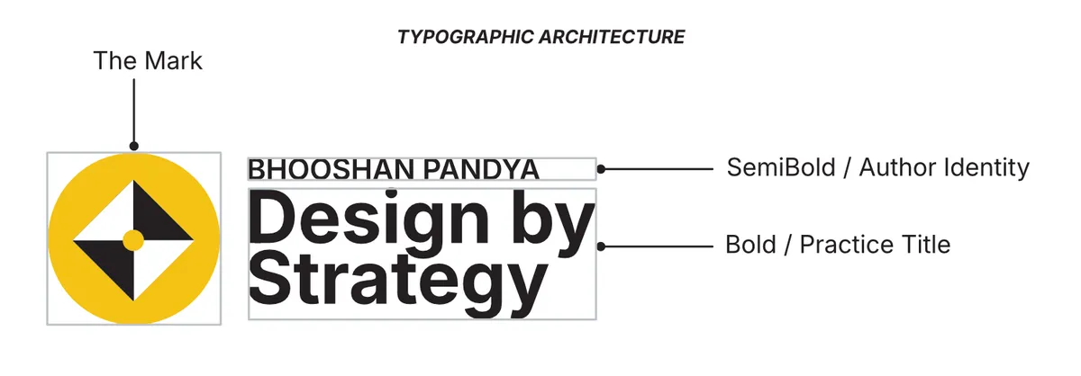
- The Wordmark (Inter Bold): Set in a clean, authoritative neo-grotesque sans-serif, the two-line stacked wordmark matches the visual weight of the graphic icon. The small-caps author line above establishes clarity and personal accountability without overwhelming the primary practice name.
- Editorial Color Palette: The brand relies on warm neutrals (cream or stone) rather than stark, harsh whites. Grounding the high-contrast black-and-white mark within a warm yellow circle creates an editorial, publication-like atmosphere designed for comfortable long-form reading.
Design for the System, Not Just the Screen
Every line, angle, and hue in this identity was chosen to reflect a simple truth: start with the system, then design the solution. The mark stands as a daily visual commitment to diagnostic rigour, directional clarity, and thoughtful execution.
Appendix: Glossary of Terms
Mark (or Symbol): The non-text graphic icon, emblem, or visual signifier representing a brand. It serves as a visual shorthand for the brand’s identity when used alongside or independently of text.
Wordmark (or Logotype): A distinct, stylized typographic treatment of a brand’s name. Unlike a graphic icon, a wordmark relies entirely on letterforms to convey brand identity.
Lockup: The formal visual arrangement and proportioned pairing of a mark (symbol) and a wordmark into a single, standardized logo block.
Neo-Grotesque Sans-Serif: A genre of modern sans-serif typefaces (such as Inter, Helvetica, or Neue Haas Grotesk) characterized by neutral, highly structured letterforms, uniform stroke weights, and high legibility. They are designed to convey clarity and objectivity without decorative flair.
Double Diamond Model: A foundational design thinking framework developed by the UK Design Council. It maps the iterative problem-solving process across two stages of divergent and convergent thinking: Discovering the right problem, Defining the focus, Developing potential solutions, and Delivering the final result.
Systems Thinking: A holistic analytical framework that evaluates individual components in relation to the entire ecosystem, examining how people, processes, technology, business goals, and constraints interact as an interdependent system.
Diagnostic Target / Reticle: A visual pattern or crosshair used in optics, photography, and engineering for precise alignment, measurement, calibration, or focal targeting.
Compass Rose: A figure found on maps, nautical charts, and compasses displaying the orientation of the cardinal directions (North, South, East, West), used symbolically in strategy to represent navigation and directional clarity.
Center of Excellence (CoE): An organizational structure or specialized team that establishes standards, best practices, governance, and capabilities to enable a specific discipline (like design or AI) to operate consistently across an enterprise.