FINANCIAL SERVICES
Improving Usability in Complex Financial Workflows
Overview
Financial applications often operate within strict technical and operational constraints. Improving the user experience can require more than changing the interface: it means understanding how people complete tasks, where errors can occur, and which improvements are possible within the existing systems.
In this engagement, I conducted a usability review of cash management applications and analysed and redesigned a manual funds deposit PDF form for a major financial services organisation. The work focused on making financial workflows clearer and more intuitive while respecting restrictions on changes to the underlying applications.
The challenge
The cash management applications had been developed by a third-party vendor, and changes to their user interfaces and core banking functionality were restricted. This limited the scope for directly addressing usability issues within the existing applications.
The manual funds deposit form presented a separate challenge. The source case material identified an error rate of 26% for submitted forms, highlighting an opportunity to improve how users understood and completed the required information.
The central challenge was to identify practical usability improvements across both digital applications and a document-based workflow, without assuming that the underlying systems could be modified.
My role
I contributed usability analysis and interface design expertise across the cash management applications and the manual deposit form. This included observing employees using the applications, assessing interfaces against user tasks, examining the form's usability, and developing recommendations and a revised form design.
The engagement required balancing user needs with technical constraints, distinguishing improvements that could be made at the interface level from changes that would require broader system intervention.
Engagement approach
The work combined contextual inquiry, task-oriented usability analysis, and form redesign. Examining the applications and the PDF form together helped build an understanding of the wider workflow rather than treating each interface in isolation.
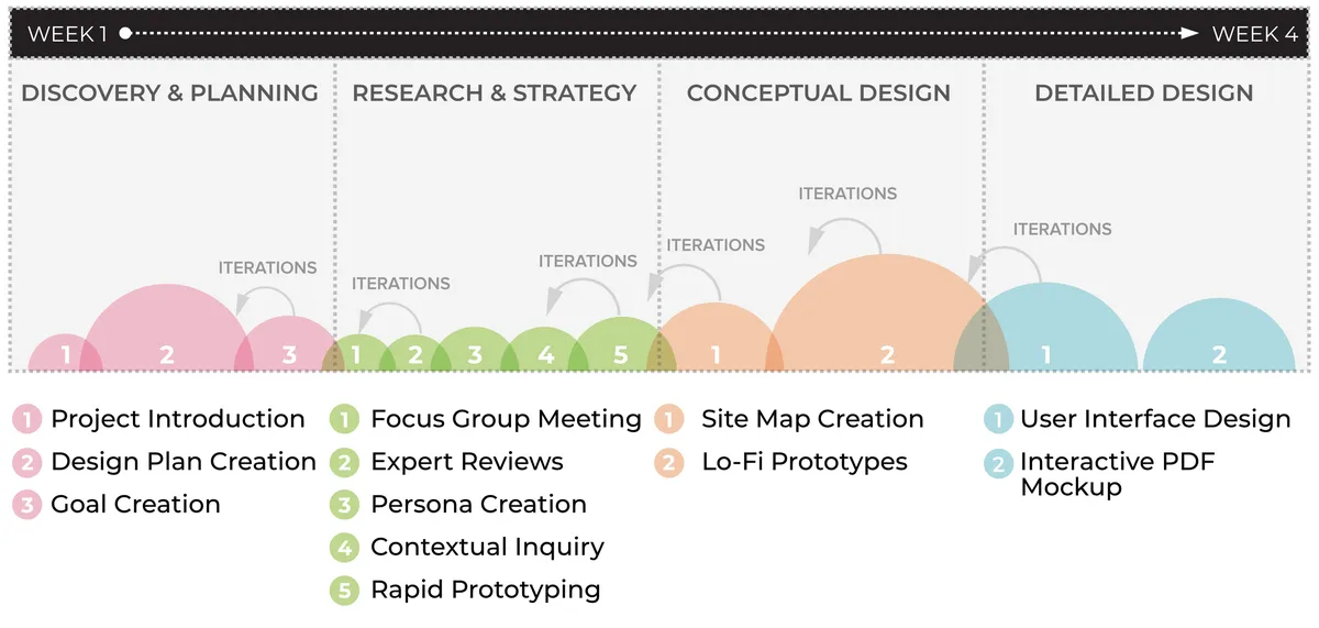
Engagement process for assessing existing cash management interfaces and redesigning a manual funds deposit form.
1. Observe users in context
Contextual interviews and observation of employees working with the applications helped reveal how users approached their tasks and understood the existing interfaces. This provided evidence to inform the usability assessment.
2. Review application usability
Three cash management application interfaces were reviewed with attention to task completion, interface clarity, and the constraints imposed by the existing systems.
The analysis also considered a broader recommendation to consolidate the three applications into a single system. That proposal was not accepted, reinforcing the need to distinguish the ideal user experience from what was feasible within the organisation's technical and operational constraints.
3. Analyse and redesign the PDF form
The manual deposit form was assessed from the perspective of the people completing it. The redesign applied a progressive disclosure approach to make information easier to process and incorporated more comprehensive error-handling capabilities.
The objective was to help users understand what information was required, complete the form more confidently, and address errors more clearly.
4. Develop practical design recommendations
The resulting recommendations focused on a clearer, more comprehensible interface and improvements that could be pursued without changing the underlying core banking system. This kept the proposed solutions grounded in the technical boundaries of the engagement.
Deliverables and strategic significance
The engagement produced several outputs:
- Usability review of three cash management applications: An assessment of existing interfaces and their support for users' tasks.
- Contextual inquiry findings: Observations and insights into how employees interacted with the applications.
- Redesigned manual funds deposit PDF form: A revised form using progressive disclosure and more comprehensive error handling.
- Interface design recommendations: Practical improvements to clarity and usability within existing technical constraints.
- System-level recommendation: A proposal to consolidate three applications into one system, which was not accepted.
The significance of this work lies in recognising that usability improvements do not always depend on a complete system redesign. When technical constraints limit what can change, contextual research and careful interface analysis can help identify more targeted opportunities.
The form redesign addressed a workflow associated with a reported 26% submission error rate. That figure describes the original problem, not a verified post-redesign result. The case therefore demonstrates how usability analysis can inform a focused design intervention without overstating its measured impact.
Explore other case studies →
AEROSPACE & TECHNOLOGY
AGRICULTURAL FINANCE
CONSUMER GOODS & MANUFACTURING
PHARMACY & HEALTHCARE
RETAIL PHARMACY
SUPPLY CHAIN & LOGISTICS
TELECOMMUNICATIONS
TELECOMMUNICATIONS